Tuesday, November 24, 2009

Steps to doing a microcalligraphy drawing.

Let me first state, that I call it microcalligraphy because to me --and this is my materials science engineering side-- micrography is microscopic analysis of material characteristics like microstructure.

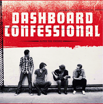
The first step is to choose a picture. For this instance, dashboard's new album picture will be the workspace. Black and white pictures are easiest and best to use, but color pictures can be converted to black and white by using a picture editor and changing the color mode to grayscale.

The next step is to choose the area of the picture you want to work with. Grid off the area in equal blocks that you see fit for the picture. They will be used to help judge size and to help scale the picture.In this picture I used red ink to outline my grid so it's more visible. Usually it's a good idea to use light pencil marks instead.


Then you pick a size for the picture to be. The size you want to work on is generally up 2 you, but to prevent distortion, try to keep the ratio of width and height the same. If you don't, then it's going to be on your own artistic insight to conceptualize the spacing (Which is what I did for the dashboard picture, and used the grid to help with sizing and spacing relative to each other). Once you have the width you start drawing the outlines of images and of some shade boundaries, but the picture should mostly be blank.


The rest of the steps will follow in weeks to come.

Sunday, November 22, 2009

Practicing


The flower is one of the practice pictures I've done. I choose an intriguing black and white flower picture (what flower I do not know) and recreated the picture using microcalligraphy and some of my own interpretations. The second picture is one of the techniques I've wanted to analyze for the microcalligraphy drawings.

Technique #1 is the limited technique that can only really accommodate darker shades. It will be very useful for using in the darker parts of the structure. Technique #1 is done by changing the pen I was using. Different pens have different tip sizes, and that’s what I was utilizing to do this first shading. It will also help with the intermediate shades if used in combination with another technique. It will not accommodate for the lighter shades.

Technique #2 utilizes the changing of the letter spacing. This technique is very handy to use and it’s quite easy. Letter spacing also does not require the changing of, or the manipulation of shape of the letters themselves. It keeps the works in tact until the darker shades are reached – for those, a different shading process would be more ideal in order to maintain legibility. This technique is useful in light shades, but does a poor job with very intermediate shades.

Technique #3 has the obvious limitation of size within the drawing parameters. This was by far the most surprising technique. I expected that the larger the size of the letters, the darker they would turn out. It is indeed the opposite. The larger the text is, the lighter the shading appears. Again, with the limitations, it might only be useful in a couple of instances, and even then, it’s only helpful with intermediate shades and darker shades.

Technique #4 was useful in proving a point that the upper case and lower case letters do not make a difference. This is handy in that the case of a letter can be chosen to help with the shape of the picture, line, or curvature that the letter is supposed to follow along with. There may be a small difference, but it’s really not noticeable from my standpoint.

Technique #5 is specific toward shaping and not so much shading. In the aspect of shading, a darker shade can be created by using cursive writing, while a lighter shade is characteristic of print. As seen with part B, this technique only really works when the letters are touching. The Curvier letters do not really make a difference. The style is useful in that the cursive can create definitive lines in the art. These lines are connected. Print can create lines of shading. So the outline should be done in cursive.

Technique #6 is another size description. In this case the size makes a difference in the opposite effect. The smaller the letter size, the lighter the shading (per unit of space). It will help in areas where text size isn’t as important, such as the background.

Technique #7 attempts to vary the width of each letter to see how it affects a line. As one would expect, the thin widths are darker, and as the letters widen, they become a lighter tone. This doesn’t reconcile with white areas, or light gray shades. The style is much more textured, but it is harder to read, especially with the darker areas. It is a good technique for the grays.

Technique # 8 was a play on the 7th technique. The singular width of a letter is opposite of the earlier affect. It actually has minimal shading affect and more of a contour affect. The lines used make a useful contrast of curvature rather than a shading device. It will probably be used to help create a focus point in the final artwork.


This is a picture that I have done to practice the techniques. It is a man and it encompasses song lyrics from songs that came up when I shuffled my music collection.
Current Status


I'm going to try to keep fairly frequent updates from here on out. The part that I'm working on right now is a couple practice drawings before I get to the larger picture. They are not coming out as completely planned, and they take a lot of time and work. A simple practice flower that I did took roughly 5 hours -- and that is with most of the words made up on the spot. The problem that I've run into is the small scale which I did on the pieces so far makes the letters hard to read in some spots. I need to resolve this issue quickly. I'm working a larger practice picture to see if the problem is eradicated on a larger scale.

The research part of this project has grown some strength. The growth is from a couple ideas of the readings I've done for class, namely George Lipsitz, "The Possessive Investment in Whiteness". I'd like to add some of his aspects of the progressive investment in whiteness on the picture. I want balance in the drawing, so I prefer race not receive a larger ration than it deserves. I'd also like to add some of the political confusion we have with the Native American Tribes/Nations.

A large amount of the readings we do propose only the first step in change: admitting there is a problem. I understand that this is a very hard step, and that step 2 could reduce the argument of a particular text for a specific task. I think I'm in a position where taking that second step, and proposing a starting place for change is not going to compromise my work. Either in the light or in the gaze of lady liberty I want to include where I see the solution; the future I want to move toward-- the second step.

As far as research of oppression, I've just stumbled upon google's timeline feature. For a very interesting set of results.
Does your timeline for oppression match up?

To leave off with some really cool micrography art.

Tuesday, November 17, 2009

Final Picture Selection


This is the photo I will choose to emulate and recreate for my artwork. Compared to the other photographs, this one has more texture which is great to create with the text shading. The feature that grabbed me to this one is the face. I want Lady Liberty to have her face in the picture so I can try to give life to her expression. I want audience members to contemplate what she is thinking about. This picture has the aesthetic wow factor that really attracts me to it. The black and white is balanced in almost a way that says the good and bad is balanced. It gives a lighter mood to the picture which makes me feel that it is more inviting. I wanted the picture to be grabbing as well as inviting. In the National Portrait gallery and National Gallery of Art, the pictures that were lighter were much more inviting.

Runner up


This photo was a close second. The other picture was more captivating, although I do like that the entire statue is in this picture. I think this represents freedom well, and the full body gives creedance to a full commitance to freedom. It is a powerful picture because the powerful statue. It is almost if the statue is lighting the dark (tyranny) and offering us the light (freedom). Very power picture indeed. It lacks the subtlety of the other picture I selected and it lacks an emotional "umph" that really helps with inspiration.

Monday, November 16, 2009

Radio Silence


To end the silence that has been seen over the last couple days I'd like to explain what's been going on. Apart from the engineering tests, and the many projects and homework assignments that I've completed--not to mention one or two minor home projects as a diversion from responsibility (laser scanner, and Emergency Party Button)-- I've been focusing on revamping my motives for this project. Why did I want to do this drawing? What do I want from this drawing? What makes this more than just a hobby or art project? Why legislation and laws? What message am I trying to convey? Why is that message important to me? How do I want to develop from doing this? What do I want the audience to get from it? I've been looking for the inspiration that is going to drive this project. To kill the suspense, here is what I've determined so far.

This artistic vision is an extension of an art expression I found enjoyable during my high school senior year. Micrography or microcalligraphy really interested me, and was enjoyable, but what won the project over was what I could express. I could show the beauty of a representation, with the ugliness described in the pictures. I could give a piece of art 2 faces to live. In my high school piece this took the form of a piece of a baseball glove (catchers mitt, the position that I played) and the shading was done with the Mitchell Report. The report details all the players who allegedly cheated by using steroids or HGH. The darkest hour of baseball (the cheating) was used to create the darkest shading throughout the glove. The areas of lighter shadings were comprised of my personal baseball stories. The binaries, dichotomies, and contradictions possible to portray are endless! The controversy is brilliant!

Why the statue of liberty and legislation? Just Politik was our first focus for honors humanities when I was a freshman. The idea emerged from the presidential debates which caused quite the stir of interest in politics. My interest was much less for the politics at the time, but the culture itself. The binary's from freedom and servitude along with justice and injustice came to mind. Lady liberty was the perfect candidate for my project for representing the positive of all American idealistic dichotomies.

I want this drawing to help me develop as a human. I don't want it to be some piece of art for a mindless audience. I want people to see below the surface. Hidden behind the ideals of this country are the governmental infrastructure that alienates and disseminates the people. I want to remind people that face value is laughable if it is not supported from the under workings. I want to decipher if we really are the land of freedom that the schools tell us we are, the hippies criticize us for not being, and the young hope we are.

Art project or hobby this is not. It is a means of expression and self discovery. An art project would be an empty picture. It would have no meaning, no context, no author and no motive. An art project is a doodle in a math class. It is a development of art talents. This project is not that. I will do a couple art projects in the process to lead up to the final work. The final work needs research. It has a depth, meaning, context, author, and motive. This project is exploring the phenomena of cultural ideals and their contrary laws.

But why legislation and government action. There is a clear difference to me in what the cultural ideals are and the reflection of culture in the law. Integrity is a huge foundation for moral code. I would like the country I live in, who claims to be so great, to live up to the promises it endows to all people. Government action is the framework of the country. As far as I'm concerned, the government will make the same mistakes and have the same failings if we forget the past and present failings.

As anyone else, I would like to convey many messages, especially one: dont be a sheep. However, this project will focus on one main message. We need to work harder for freedom and justice. If one looks close enough at the promises of freedom, then they may see that although they are not tyrannical, they may fall shy of freedom and justice. The message needs to be said, and I don't think people are aware of the amount of injustices and abridging of freedom that exists. The piece will not change the world, it will not change the laws, and it may not even change an individuals perspective, but if a viewer takes one extra second to think about American Ideals, then I've done my job.

My inspiration for this comes from the denial of entry to this country. It comes from the laws which make teenagers an awkward mix between minors and adults but gives grounds to be neither; It comes from the immigrants who work hard; It comes from the sheep people who vote for elections blindly; It comes from the prejudice, racism and hate from the congress; and it comes from the people who believe that this is the greatest country on the face of the earth--because it is.

Wednesday, November 11, 2009

Words


So after a while of brainstorming, I thought the most appropriate way to guess the max number of words I would need for the final picture would be to fill a 1 inch box with the Gettysburg Address. Then I would multiply the amount of words--as designated by computer standards-- by the estimated size of the final piece.

With significant figures, I'm gonna need on the realm of 600,000 words.

*no the entire address did not fit in the box; i was somewhere about 6 words shy.*