Thursday, May 20, 2010
Random thoughts: Disability
I took a course on the discourse of disability over the winter term. I was surprised by the empowerment of a murderball wheelchair as compared to the typical wheelchair. (It was very gladiatoresque). I was just thinking about the cultural thoughts of a cast. They are generally welcomed because they can be designed and doodled on and etc. As an engineer and hardware mod fan, it would be very awesome to see a movement towards modifying wheelchairs to get away from the notions of fragile and create a new mentality about them. Maybe I'll design one in my free time this summer (full of LEDs and such((mod.ed laser pointer as well?))).

Tuesday, May 18, 2010
Gallery proposal
Gallery Proposal:
A number of things can be said about symbols we associate with our ideals as an American culture. An interesting piece is to look at the contrast between our ideals and our actions. To immortalize some of the dissonance and express some concern for actions a series of microcalligraphy pieces should be completed. A list and description follows:
~Eugenics – I’d like to add a display of the contrasting ideals of Americans about eugenics. The picture I want to use is either from Disney’s The Lion King or the movie about Spartan soldiers 300. The scene I would like to use is where the child gets held up from a cliff. In The Lion King he is present to the kingdom while in 300 the child is inspected for flaws.
• Buck v Dr. Piddy
• Skinner v. Oklahoma
• Supreme Court buck v. bell opinion by justice oliver Wendell holmes jr.
• Virginia eugenical sterilization act
• Laws and sterilizations by state
• Popularizing eugenics through college text books
• State laws limiting marriage
• Some pieces by Goffman
References:
Lombardo, Paul A. Three generations no imbiciles:Eugenics, the supreme court and buck v. bell Johns Hopkins university press. Baltimore 2008
Selden, Steven Inheriting Shame: The story of Eugenics and Racism in America Advances in Comtemporary Education Thought Series. Volume 23 Solitis, Jonas F. Editor isbn 0 8077 3812 3
~Racism – I’d like to propose a drawing to tackle the issue of racism. I want to focus on the progressive investment of whiteness and a large amount of focus on education system flaws and racisms. The picture of choice would be a city to emphasize our structural creation of racism. The Jim Crow laws would be very handy to use here.
~Freedom and Slavery-- I’d like to do a piece that focuses on education as the source of freedom and empowerment. The image I’d like to use is that either of a book, or of a clearly recognizable school.
~Genocide – This will be a hard topic to cover. At the origin, the picture will compare the massive Indian genocide in America to Dafur and other regions and incidents of modern genocide. The picture I would use is one of an empty trail.
~Homonegativity – I’d like to emphasize the convenience of public v private dichotomies used in United States politics. The particular example I’d like to use is homosexuality. The image of choice would be of two people facing away from the audience, walking down a path holding hands: gender unrecognizable. I’d like the words to really guide this one.
~Censorship and the Internet – This picture would be a simple laptop with hands on keyboard. The words would reflect a large amount of censorship attempts on the internet, as well as good examples of censorship (i.e. legislation preventing child pornography on the internet)
Supplimentry report
PURPOSE:
A project I was working on named “Obfuscating Liberty” was the driving force behind the research I’ve done in micro-calligraphy. This research is a part of that project for which the abstract is found below:
Obfuscating Liberty
The work-in-progress currently Titled Obfuscating Liberty explores the dichotomies that exist in a nationally recognized symbol with the legislation and experiences of the people which are used to create a person sized rendering of the statue of liberty. The image is created with a technique called microcalligraphy (micrography to some) which utilizes letters to create the lines and shading for the work of art. What began as an investigation of United States history and cultural studies soon turned into a quest on the artistic side of how to create the image and convey the message and emotions (and even what should be conveyed). The words tell a story, one of opposition: legislation and government will has prevented the United States to live up to its ideals as immortalized through symbols. The Statue of Liberty represents freedom, liberty and equality. From afar, one sees the Statue of Liberty, standing for American ideals, but up close we see the backstage of the nation and all the polluted legislation and personal accounts. The image is created by using the legislation (e.g. the Immigration Quotas, the Patriot Act, etc. – old to new from bottom up) that devaluate the self-proclaimed freedoms of the United States. The research process entailed two main processes: researching legislation that opposes the American ideals and research regarding how artistic qualities can be used to created emotional entanglement with the work. The painting challenges the congressional interest and agenda’s as compared to American Ideals. One message is certainly a call of duty: This country needs to stop contradicting its ideals.
The research added depth and insight into the calligram that I created, but it was also the enabling driving force that overall made the drawing possible. The Statue of Liberty came from many pictures that I found online and overall used. In the process, I have blown many deadlines, and will blow many more: rushing the process for this type of artwork is a mistake. The purpose of this research is also for others trying to or inspired to try micro-calligraphy, or interesting in learning more.
INTRODUCTION:
A quick internet search will leave your head spinning. Without proper definitions and aims, the terms surrounding micrography and micro-calligraphy will quickly deteriorate into a semantic argument. Micro-calligraphy and micrograhpy will both be the term used when referring to letters, words, and sentences strung together in a manner and design which creates an illustration. Micro-calligraphy will be the preferred term used because micrography also refers to the microstructure analysis of materials using a microscope. As a Materials Science and Engineering major, I tend to favor less confusion and prefer the use of the term micro-calligraphy.
Micrography and micro-calligraphy both will be referring to the creation of a calligram—a calligraphy work that is designed as an illustration. Calligrams are of main interest and techniques using calligraphy to create lines and shading are used to create the image. Asemic writing—abstract in meaning, but recognizable as intended to be text—is often included in this category; however, it will not be discussed nor does the term micro-calligraphy include or segregate it.
HISTORY:
The internet has become such a dominant discourse that it would seem senseless to start anywhere else. A flow chart is the best way of showing a progression through the internet as time elapses. Soon after the initial search begins a flow of new but vaguely familiar terms arise: micrography, micro-calligraphy, Hebrew Calligraphy, Islamic Calligraphy, Arabic Calligraphy, calligram, Persian Calligraphy, pattern poetry, typography, and concrete poetry.
The simple question of “where did this style of art begin?” was found to be anything but simple. The origins seems to be favorably pointed to the Jewish faith. There are many pieces of art relating to the old testamite done in hebrew micro-calligraphy. In fact, most of the top results of the search engine google actually relate to hebrew or jewish micro-calligraphies. It seems fair to say that the artform was popularized in Jewish art culture. But a better answer lies within the origins of calligraphy itself.
The calligraphy entry in the Coloumbia Encyclopedia breaks calligraphy into three distinct types: European, Arabic, and Asian. To breakdown the grouping further (albeit still regionally) we can add Tibetan, Indian, Nepalese, Islamic (which is the same as arabic), Persian,, Japanese, Iranian, Western, and Maya calligraphy. To add to these types I’d also add the modern Typography which often uses ASCII characters to make pictures.
The art encyclopedia defines Microcalligraphy as “Minute writing arranged in geometric shapes or drawn as outlines of objects, animals or humans. Hebrew micrography is one of the most characteristic of Jewish art forms.” ("Micrography." ) “In the Islamic and Chinese cultures, calligraphy is as highly revered as painting.” (“calligraphy”) Calligraphy is represented in popular culture in such a way where the past is shown to respect calligraphy as an art, but the modern culture has lost it as an art. Calligraphy is an art. Microcalligraphy is as well, but size is often the feature of style that is being changed.
Calligraphy emerged in Europe during the 1st century. Calligraphy masterpieces began to emerge. From the 8th century the Irish Book of Kells cam and the English Lindisfarne Gospels.¬ Monks were trained to hand write scriptures with eloquent handwriting. Matteo Contugi, Gianrinaldo Mennio, and Pierantonio Sallando were well known for their calligraphy in the middle 15th century. ("European calligraphy.") Arabic Calligraphy was commonly practiced in the Qur'an. (“Arabic Calligraphy”)
....
Works Cited
“Arabic Calligraphy” The Columbia Electronic Encyclopedia, Sixth Edition. Columbia University Press., 2010. Answers.com 16 Apr. 2010. http://www.answers.com/topic/calligraphy
"calligraphy." Britannica Concise Encyclopedia. Encyclopædia Britannica, Inc., 1994-2010. Answers.com 16 Apr. 2010. http://www.answers.com/topic/calligraphy
"European calligraphy." The Columbia Electronic Encyclopedia, Sixth Edition. Columbia University Press., 2010. Answers.com 16 Apr. 2010. http://www.answers.com/topic/calligraphy
"Micrography." The Concise Grove Dictionary of Art. Oxford University Press, Inc., 2002. Answers.com 16 Apr. 2010. http://www.answers.com/topic/micrography
Reflections
This is the reflections that I have in a supplementary paper with the piece.
Reflections
I. Failures, Regrets, and Learning:
There is a steep learning curve we all encounter when reaching out and learning new things. If not for those failures improvement would be impossible. These failures are merely vessels for learning, and here I share mine in order to aid others.
The biggest overall mistake I made was not involving other people in the writing process. It’s not that the work was too great for one person. The work is easily managed by one person, but it doesn’t represent the diversity of the country well in this piece. It would be more interesting to me if I could have made this piece more meaningful by including more people in the creation of it. Having researched the legislation that I wanted to include, I should have spent one day in the library (or another public forum) asking people if they would like to participate. The multiplicity would have added a very interesting dynamic.
A much more minor failure was the timeline I chose. I did not give sufficient time to doing the actual project. I would have liked more time for the completion of the whole, but many more small deadlines for pieces of the project. Time management is tricky because largely it was trying to get motivation AND inspiration at the same time. Not an easy feat when exams are on the horizon.
I started with the most important piece, then because of circumstances I moved away from what I originally intended. If given the chance or choice, be careful about doing it. There was a loss of the vastness of the contradictions of American ideals. Balance is key, but remember to stick with the goal.
Finals have sucked the life out of me
So after finals, which have sucked the life out of me--4 days studying for over 10 hours a day-- I am finally done and free. I have neglected posting for a while because of my classes and finals. I'll do my best to go through and add and update things.
Thursday, April 22, 2010
Honors Humanities Research Symposium.
The Honors Humanities Research symposium was today. It was absolutely terrific. . . apart from carrying the 36" x 80" project frame up to the dorm from my house that is. I was really impressed with everyone's work. It was amazing. My peers worked extremely hard on their projects.
The presentations in the panel with me were fantastic. "Art in Action: Visual Arts and Activisms" was the panel composed of Cheryl Tam, Laura Semple, Evelyn Sievert and Douglas Trigg(myself). Laura said something that really struck me during her presentation. "Take a second look." Its a simple as that. After hearing that, I changed the focus of my presentation. There was a lot of information that I needed to share about my project: processes, methods, techniques, messages, importance, details, etc. I shifted to the importance of not just my project, but all our projects.
As an engineering major, I think it's important to justify things. In the world of research, numbers, and science, where does the importance of art come from. I cannot give an all encompassing answer, such would be too simplified, but I do offer an answer that satisfies my acme of my intentions: Take a journey of self discovery, and create something that inspires others to "Take a second look" (and hopefully take their own journey of self discovery).
The Journey of Self Discovery was an important one for me. Embarking on this project and program almost 2 years ago, I had no idea what to expect, or where I was going. At the end, I understand that this was a project that helped me understand my own definition of Liberty and oppression and the ultimate goals of the United States. My personal definition of Liberty includes all people: i.e. Liberty for some is not Liberty at all, it's privilege. (Disclaimer: that's a large generalization, when in practice it gets complicated, but that's the overall goal. I'm an engineer and I reserve the right to simplify.)
"Take a second look." So simple while remaining vastly complex. It's beautiful. I think all artist want someone to take a good look at something. Activism in art: "Take a second look at my art, it is not what it appears. Take a second look at the question my art poses. Take a second look into what you think about something. Take a second look at the issue you are overlooking." I want to inspire thought. Obfuscating Liberty was largely a project to inspire thought. My thought was lead by Lisa Duggan and dichotomies seen in American culture and governmental bodies.
A picture inspires thought. Thought drives action. Art activates action.
http://www.honorshumanities.umd.edu/TransactionsConferenceProgram412.pdf
The presentations in the panel with me were fantastic. "Art in Action: Visual Arts and Activisms" was the panel composed of Cheryl Tam, Laura Semple, Evelyn Sievert and Douglas Trigg(myself). Laura said something that really struck me during her presentation. "Take a second look." Its a simple as that. After hearing that, I changed the focus of my presentation. There was a lot of information that I needed to share about my project: processes, methods, techniques, messages, importance, details, etc. I shifted to the importance of not just my project, but all our projects.
As an engineering major, I think it's important to justify things. In the world of research, numbers, and science, where does the importance of art come from. I cannot give an all encompassing answer, such would be too simplified, but I do offer an answer that satisfies my acme of my intentions: Take a journey of self discovery, and create something that inspires others to "Take a second look" (and hopefully take their own journey of self discovery).
The Journey of Self Discovery was an important one for me. Embarking on this project and program almost 2 years ago, I had no idea what to expect, or where I was going. At the end, I understand that this was a project that helped me understand my own definition of Liberty and oppression and the ultimate goals of the United States. My personal definition of Liberty includes all people: i.e. Liberty for some is not Liberty at all, it's privilege. (Disclaimer: that's a large generalization, when in practice it gets complicated, but that's the overall goal. I'm an engineer and I reserve the right to simplify.)
"Take a second look." So simple while remaining vastly complex. It's beautiful. I think all artist want someone to take a good look at something. Activism in art: "Take a second look at my art, it is not what it appears. Take a second look at the question my art poses. Take a second look into what you think about something. Take a second look at the issue you are overlooking." I want to inspire thought. Obfuscating Liberty was largely a project to inspire thought. My thought was lead by Lisa Duggan and dichotomies seen in American culture and governmental bodies.
A picture inspires thought. Thought drives action. Art activates action.
http://www.honorshumanities.umd.edu/TransactionsConferenceProgram412.pdf
Friday, April 16, 2010
Obfuscating Liberty
I finished the project and here it is! When I finished the outline it was +3376 words and with the shading it is +5000 but I haven't done a count yet.


From a section of a supplimentary report the the project:
**UPDATE there are more than 5,900 words in the work


From a section of a supplimentary report the the project:
Making sense of it:
The intent of the project was to show the binary through American ideals and the governing body’s actions. A way to breakdown and understand the political points, stances, and legislation was the key in developing the project. The path came in the form of Twilight of Equality by Lisa Duggan. The main dichotomies depicted in this piece are: Liberty and Oppression; Public and Private; AND Privileged and unprivileged.
Government documents of all sorts –laws, acts and orders, and court rulings—have been researched. The overbearing amount of evidence to support different arguments has led to a proposal for a gallery. Different pieces of solid coherent individual arguments could be constructed into different pieces instead of pulling people in many different directions in one piece. “Obfuscating Liberty” is the first experimental picture of the many possibilities for the gallery.
**UPDATE there are more than 5,900 words in the work
Wednesday, March 10, 2010
Lisa Duggan
This is from my document process:
Lisa Duggan Twighlight of Equality Reflection:
There is an interesting surface which we face in politics. Neo-libralism is the dominating mentality of contemporary political frames. Lisa Duggan gives us the most recognizable factor contending in this stagnant politics – which may possibly be the end of history as proposed by Francis Fukuyama. The major contending dichotomy of public verses private is the dominating mentality of politicians who more or less differ in opinion of ‘what is public and what is private’ based on convenience. The distortion of social liberties comes from the direct influence of this public v private mentality. What are we entitled to as private and what is going to make up the public sphere?
The lens that Lisa uses inspired me to think about liberty in the same way:
What dichotomies exist?
Liberty v. Oppression
Public v. Private
Privileged v. disadvantaged.
The interesting part of the relationships is that they build. We can think about being granted certain Public liberties (i.e. freedom of speech) and Private liberties (i.e. due process). Privileged liberties are a little more amorphous. Within Liberty that we propose, who is privileged and who is not? There are a lot of circumstances. Can you have Liberty if you Privilege some and disadvantage others? It’s necessary to a point; we must disadvantage those who mean to do harm. But at what cost? Where is a balance? That’s what I explore in my research: what is liberty; what balance is acceptable to me, what isn’t?
Duggan, Lisa. The twilight of equality : neoliberalism, cultural politics, and the attack on democracy. Boston Mass.: Beacon, 2004. Print.
Thursday, February 25, 2010
micro-calligraphy: how to part 2
The first part of this process is described in this blog post: http://americaarcana.blogspot.com/2009/11/steps-to-doing-microcalligraphy-drawing.html
After you have the initial outline you need to choose the words. They are often hard to find and generally you need a lot. I can fit about 256 words per square inch. Generally the amount and size used will depend on what you want the outcome to look like. Experimentation is key, but a couple tricks do exist.
Once you select the words (I selected a couple of dashboard songs that I like: Thick as Thieves, Hands Down, Vindicated and Get Me Right) then you begin with the outline of the figures. Use cursive to create solid lines. Broken or inside lines can usually be done with printed fonts of your writing. Stylistically, you do not have to match your letters to the curves, but write with your cursive letters being about on the lines you drew. Some cases you want to be inside, and others outside. It goes by judgments and artistic creativity. (largely a matter of preference.)

After the outline, generally shading is done in all print. Different sizes and techniques that I highlighted in a past post can be utilized to cause shading gradients. techniques
**update** my schedule is too busy to finish shading now. Hopefully I'll be able to finish this later.
After you have the initial outline
you need to choose the words. They are often hard to find and generally you need a lot. I can fit about 256 words per square inch. Generally the amount and size used will depend on what you want the outcome to look like. Experimentation is key, but a couple tricks do exist.Once you select the words (I selected a couple of dashboard songs that I like: Thick as Thieves, Hands Down, Vindicated and Get Me Right) then you begin with the outline of the figures. Use cursive to create solid lines. Broken or inside lines can usually be done with printed fonts of your writing. Stylistically, you do not have to match your letters to the curves, but write with your cursive letters being about on the lines you drew. Some cases you want to be inside, and others outside. It goes by judgments and artistic creativity. (largely a matter of preference.)

After the outline, generally shading is done in all print. Different sizes and techniques that I highlighted in a past post can be utilized to cause shading gradients. techniques
**update** my schedule is too busy to finish shading now. Hopefully I'll be able to finish this later.
Tuesday, December 1, 2009
Emotion and Purpose
The twilight of equality has been a wonderful switch from the artistic aspect to the political aspect. For a long time I have been convinced that the mode of this project would be mostly facts. Legislation, executive acts and orders, and constitution passages would take up the entirety of the picture. Then I shifted to adding certain reflections into the piece. Clearly my engineering side was prevailing. This was due to a desire to reflect on the growth that I’ve made because of this project as well as the uncertainty in the amount of writing I would need. Now I’ve made a final switch, though far from executive decision as of yet, but I see a need for a couple experiences to be included.
When I originally wrote decided on this project I wanted a clear statement from the picture. I wanted a picture that could not be construed. Now I think the picture can be construed to an alien agenda if I only use legislation and facts. This will hide and mystify any agenda that I may have, but I think it also gives credence of approval to those agendas of which I would hesitate to aid.
If I do include a couple experiences of people (e.g. an experience of a patriot act witness), then it could be construed as an individual case and enable the poor argument that the experience that I present is not representative of the whole and therefore the rest of the work is equally wrong. Without the inclusion of a case, I feel that the emotional aspect will be completely overlooked. The visual appeal may overshadow the writing if no emotion grappling text is present. In this work, the words are just as important as the picture, and I don’t want that to be overlooked, but if the picture isn’t viewed as text and art combined, then the picture is missed.
The great obstacle is that I need a purpose: a clear, concise, discreet, and defined intent. My intent has been somewhat vague until now: Legislation contradicts American ideology. I’m looking for a more focused intent. Something that greater defines what I’m attempting to do. For now, I am going to keep exploring the political modes of control and exclusion.
*I've stopped working on the artistic aspect and shifted my focus toward the political aspect of the project. I've been reading TWILIGHT OF EQUALITY by Lisa Duggan and been researching critical perspectives of events such as the patriot act and Native American Sovereignty.*
Recently I have found that all the text I planned to use amounts to 10,000 words. I'm either going to have to change the style of writing by enlarging it and making a new prediction or I need to find a lot more text to meet my prediction of 600,000 which really amounts to about 300,000 words including the 50% of white space in the picture. Either way, 10,000 is not close to 10,000. To date, Native American sovereignty and the Fence Act are going to be on the top of the picture, but not in the torch. This means the arm and down until the crown and face. I'd like the bottom to be the foundation and begin with the Bill of Rights and be built upon by the constitution. The immigration acts and the exclusion acts will fill up the center, but for now i'm putting the artistic aspects and hold and gathering the sources to create the work.
*I have gotten all supplies*
2 micron 005 pigma pens
2 Staedtler .1mm pen
2 micro 207 pens
Roll of drafting paper.
For now, This is the configuration of the artwork itself.

This is the picture that I used a grid to denote where the text is gonna go.
1[a-d] Native American Sovereignty
1[e-h] Bill of Rights
2[c-e] Pariot Act
2[f-h] Chinese Exclusion Act
3[e-h] Secure Fence Act and Immegration quotas
4[f-h] Declaration of independance
For the writing pieces thus far chosen, view my entry http://americaarcana.blogspot.com/2009/10/deliverables.html
When I originally wrote decided on this project I wanted a clear statement from the picture. I wanted a picture that could not be construed. Now I think the picture can be construed to an alien agenda if I only use legislation and facts. This will hide and mystify any agenda that I may have, but I think it also gives credence of approval to those agendas of which I would hesitate to aid.
If I do include a couple experiences of people (e.g. an experience of a patriot act witness), then it could be construed as an individual case and enable the poor argument that the experience that I present is not representative of the whole and therefore the rest of the work is equally wrong. Without the inclusion of a case, I feel that the emotional aspect will be completely overlooked. The visual appeal may overshadow the writing if no emotion grappling text is present. In this work, the words are just as important as the picture, and I don’t want that to be overlooked, but if the picture isn’t viewed as text and art combined, then the picture is missed.
The great obstacle is that I need a purpose: a clear, concise, discreet, and defined intent. My intent has been somewhat vague until now: Legislation contradicts American ideology. I’m looking for a more focused intent. Something that greater defines what I’m attempting to do. For now, I am going to keep exploring the political modes of control and exclusion.
*I've stopped working on the artistic aspect and shifted my focus toward the political aspect of the project. I've been reading TWILIGHT OF EQUALITY by Lisa Duggan and been researching critical perspectives of events such as the patriot act and Native American Sovereignty.*
Recently I have found that all the text I planned to use amounts to 10,000 words. I'm either going to have to change the style of writing by enlarging it and making a new prediction or I need to find a lot more text to meet my prediction of 600,000 which really amounts to about 300,000 words including the 50% of white space in the picture. Either way, 10,000 is not close to 10,000. To date, Native American sovereignty and the Fence Act are going to be on the top of the picture, but not in the torch. This means the arm and down until the crown and face. I'd like the bottom to be the foundation and begin with the Bill of Rights and be built upon by the constitution. The immigration acts and the exclusion acts will fill up the center, but for now i'm putting the artistic aspects and hold and gathering the sources to create the work.
*I have gotten all supplies*
2 micron 005 pigma pens
2 Staedtler .1mm pen
2 micro 207 pens
Roll of drafting paper.
For now, This is the configuration of the artwork itself.

This is the picture that I used a grid to denote where the text is gonna go.
1[a-d] Native American Sovereignty
1[e-h] Bill of Rights
2[c-e] Pariot Act
2[f-h] Chinese Exclusion Act
3[e-h] Secure Fence Act and Immegration quotas
4[f-h] Declaration of independance
For the writing pieces thus far chosen, view my entry http://americaarcana.blogspot.com/2009/10/deliverables.html
Tuesday, November 24, 2009
Steps to doing a microcalligraphy drawing.
Let me first state, that I call it microcalligraphy because to me --and this is my materials science engineering side-- micrography is microscopic analysis of material characteristics like microstructure.
The first step is to choose a picture. For this instance, dashboard's new album picture will be the workspace. Black and white pictures are easiest and best to use, but color pictures can be converted to black and white by using a picture editor and changing the color mode to grayscale.
The next step is to choose the area of the picture you want to work with. Grid off the area in equal blocks that you see fit for the picture. They will be used to help judge size and to help scale the picture.In this picture I used red ink to outline my grid so it's more visible. Usually it's a good idea to use light pencil marks instead.

Then you pick a size for the picture to be. The size you want to work on is generally up 2 you, but to prevent distortion, try to keep the ratio of width and height the same. If you don't, then it's going to be on your own artistic insight to conceptualize the spacing (Which is what I did for the dashboard picture, and used the grid to help with sizing and spacing relative to each other). Once you have the width you start drawing the outlines of images and of some shade boundaries, but the picture should mostly be blank.
The rest of the steps will follow in weeks to come.
The first step is to choose a picture. For this instance, dashboard's new album picture will be the workspace. Black and white pictures are easiest and best to use, but color pictures can be converted to black and white by using a picture editor and changing the color mode to grayscale.
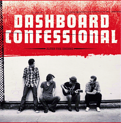
The next step is to choose the area of the picture you want to work with. Grid off the area in equal blocks that you see fit for the picture. They will be used to help judge size and to help scale the picture.In this picture I used red ink to outline my grid so it's more visible. Usually it's a good idea to use light pencil marks instead.

Then you pick a size for the picture to be. The size you want to work on is generally up 2 you, but to prevent distortion, try to keep the ratio of width and height the same. If you don't, then it's going to be on your own artistic insight to conceptualize the spacing (Which is what I did for the dashboard picture, and used the grid to help with sizing and spacing relative to each other). Once you have the width you start drawing the outlines of images and of some shade boundaries, but the picture should mostly be blank.

The rest of the steps will follow in weeks to come.
Sunday, November 22, 2009
Practicing


The flower is one of the practice pictures I've done. I choose an intriguing black and white flower picture (what flower I do not know) and recreated the picture using microcalligraphy and some of my own interpretations. The second picture is one of the techniques I've wanted to analyze for the microcalligraphy drawings.
Technique #1 is the limited technique that can only really accommodate darker shades. It will be very useful for using in the darker parts of the structure. Technique #1 is done by changing the pen I was using. Different pens have different tip sizes, and that’s what I was utilizing to do this first shading. It will also help with the intermediate shades if used in combination with another technique. It will not accommodate for the lighter shades.
Technique #2 utilizes the changing of the letter spacing. This technique is very handy to use and it’s quite easy. Letter spacing also does not require the changing of, or the manipulation of shape of the letters themselves. It keeps the works in tact until the darker shades are reached – for those, a different shading process would be more ideal in order to maintain legibility. This technique is useful in light shades, but does a poor job with very intermediate shades.
Technique #3 has the obvious limitation of size within the drawing parameters. This was by far the most surprising technique. I expected that the larger the size of the letters, the darker they would turn out. It is indeed the opposite. The larger the text is, the lighter the shading appears. Again, with the limitations, it might only be useful in a couple of instances, and even then, it’s only helpful with intermediate shades and darker shades.
Technique #4 was useful in proving a point that the upper case and lower case letters do not make a difference. This is handy in that the case of a letter can be chosen to help with the shape of the picture, line, or curvature that the letter is supposed to follow along with. There may be a small difference, but it’s really not noticeable from my standpoint.
Technique #5 is specific toward shaping and not so much shading. In the aspect of shading, a darker shade can be created by using cursive writing, while a lighter shade is characteristic of print. As seen with part B, this technique only really works when the letters are touching. The Curvier letters do not really make a difference. The style is useful in that the cursive can create definitive lines in the art. These lines are connected. Print can create lines of shading. So the outline should be done in cursive.
Technique #6 is another size description. In this case the size makes a difference in the opposite effect. The smaller the letter size, the lighter the shading (per unit of space). It will help in areas where text size isn’t as important, such as the background.
Technique #7 attempts to vary the width of each letter to see how it affects a line. As one would expect, the thin widths are darker, and as the letters widen, they become a lighter tone. This doesn’t reconcile with white areas, or light gray shades. The style is much more textured, but it is harder to read, especially with the darker areas. It is a good technique for the grays.
Technique # 8 was a play on the 7th technique. The singular width of a letter is opposite of the earlier affect. It actually has minimal shading affect and more of a contour affect. The lines used make a useful contrast of curvature rather than a shading device. It will probably be used to help create a focus point in the final artwork.

This is a picture that I have done to practice the techniques. It is a man and it encompasses song lyrics from songs that came up when I shuffled my music collection.
Current Status

I'm going to try to keep fairly frequent updates from here on out. The part that I'm working on right now is a couple practice drawings before I get to the larger picture. They are not coming out as completely planned, and they take a lot of time and work. A simple practice flower that I did took roughly 5 hours -- and that is with most of the words made up on the spot. The problem that I've run into is the small scale which I did on the pieces so far makes the letters hard to read in some spots. I need to resolve this issue quickly. I'm working a larger practice picture to see if the problem is eradicated on a larger scale.
The research part of this project has grown some strength. The growth is from a couple ideas of the readings I've done for class, namely George Lipsitz, "The Possessive Investment in Whiteness". I'd like to add some of his aspects of the progressive investment in whiteness on the picture. I want balance in the drawing, so I prefer race not receive a larger ration than it deserves. I'd also like to add some of the political confusion we have with the Native American Tribes/Nations.
A large amount of the readings we do propose only the first step in change: admitting there is a problem. I understand that this is a very hard step, and that step 2 could reduce the argument of a particular text for a specific task. I think I'm in a position where taking that second step, and proposing a starting place for change is not going to compromise my work. Either in the light or in the gaze of lady liberty I want to include where I see the solution; the future I want to move toward-- the second step.
As far as research of oppression, I've just stumbled upon google's timeline feature. For a very interesting set of results.
Does your timeline for oppression match up?
To leave off with some really cool micrography art.
Tuesday, November 17, 2009
Final Picture Selection

This is the photo I will choose to emulate and recreate for my artwork. Compared to the other photographs, this one has more texture which is great to create with the text shading. The feature that grabbed me to this one is the face. I want Lady Liberty to have her face in the picture so I can try to give life to her expression. I want audience members to contemplate what she is thinking about. This picture has the aesthetic wow factor that really attracts me to it. The black and white is balanced in almost a way that says the good and bad is balanced. It gives a lighter mood to the picture which makes me feel that it is more inviting. I wanted the picture to be grabbing as well as inviting. In the National Portrait gallery and National Gallery of Art, the pictures that were lighter were much more inviting.
Runner up

This photo was a close second. The other picture was more captivating, although I do like that the entire statue is in this picture. I think this represents freedom well, and the full body gives creedance to a full commitance to freedom. It is a powerful picture because the powerful statue. It is almost if the statue is lighting the dark (tyranny) and offering us the light (freedom). Very power picture indeed. It lacks the subtlety of the other picture I selected and it lacks an emotional "umph" that really helps with inspiration.
Monday, November 16, 2009
Radio Silence

To end the silence that has been seen over the last couple days I'd like to explain what's been going on. Apart from the engineering tests, and the many projects and homework assignments that I've completed--not to mention one or two minor home projects as a diversion from responsibility (laser scanner, and Emergency Party Button)-- I've been focusing on revamping my motives for this project. Why did I want to do this drawing? What do I want from this drawing? What makes this more than just a hobby or art project? Why legislation and laws? What message am I trying to convey? Why is that message important to me? How do I want to develop from doing this? What do I want the audience to get from it? I've been looking for the inspiration that is going to drive this project. To kill the suspense, here is what I've determined so far.
This artistic vision is an extension of an art expression I found enjoyable during my high school senior year. Micrography or microcalligraphy really interested me, and was enjoyable, but what won the project over was what I could express. I could show the beauty of a representation, with the ugliness described in the pictures. I could give a piece of art 2 faces to live. In my high school piece this took the form of a piece of a baseball glove (catchers mitt, the position that I played) and the shading was done with the Mitchell Report. The report details all the players who allegedly cheated by using steroids or HGH. The darkest hour of baseball (the cheating) was used to create the darkest shading throughout the glove. The areas of lighter shadings were comprised of my personal baseball stories. The binaries, dichotomies, and contradictions possible to portray are endless! The controversy is brilliant!
Why the statue of liberty and legislation? Just Politik was our first focus for honors humanities when I was a freshman. The idea emerged from the presidential debates which caused quite the stir of interest in politics. My interest was much less for the politics at the time, but the culture itself. The binary's from freedom and servitude along with justice and injustice came to mind. Lady liberty was the perfect candidate for my project for representing the positive of all American idealistic dichotomies.
I want this drawing to help me develop as a human. I don't want it to be some piece of art for a mindless audience. I want people to see below the surface. Hidden behind the ideals of this country are the governmental infrastructure that alienates and disseminates the people. I want to remind people that face value is laughable if it is not supported from the under workings. I want to decipher if we really are the land of freedom that the schools tell us we are, the hippies criticize us for not being, and the young hope we are.
Art project or hobby this is not. It is a means of expression and self discovery. An art project would be an empty picture. It would have no meaning, no context, no author and no motive. An art project is a doodle in a math class. It is a development of art talents. This project is not that. I will do a couple art projects in the process to lead up to the final work. The final work needs research. It has a depth, meaning, context, author, and motive. This project is exploring the phenomena of cultural ideals and their contrary laws.
But why legislation and government action. There is a clear difference to me in what the cultural ideals are and the reflection of culture in the law. Integrity is a huge foundation for moral code. I would like the country I live in, who claims to be so great, to live up to the promises it endows to all people. Government action is the framework of the country. As far as I'm concerned, the government will make the same mistakes and have the same failings if we forget the past and present failings.
As anyone else, I would like to convey many messages, especially one: dont be a sheep. However, this project will focus on one main message. We need to work harder for freedom and justice. If one looks close enough at the promises of freedom, then they may see that although they are not tyrannical, they may fall shy of freedom and justice. The message needs to be said, and I don't think people are aware of the amount of injustices and abridging of freedom that exists. The piece will not change the world, it will not change the laws, and it may not even change an individuals perspective, but if a viewer takes one extra second to think about American Ideals, then I've done my job.
My inspiration for this comes from the denial of entry to this country. It comes from the laws which make teenagers an awkward mix between minors and adults but gives grounds to be neither; It comes from the immigrants who work hard; It comes from the sheep people who vote for elections blindly; It comes from the prejudice, racism and hate from the congress; and it comes from the people who believe that this is the greatest country on the face of the earth--because it is.
Wednesday, November 11, 2009
Words

So after a while of brainstorming, I thought the most appropriate way to guess the max number of words I would need for the final picture would be to fill a 1 inch box with the Gettysburg Address. Then I would multiply the amount of words--as designated by computer standards-- by the estimated size of the final piece.
With significant figures, I'm gonna need on the realm of 600,000 words.
*no the entire address did not fit in the box; i was somewhere about 6 words shy.*
Thursday, October 22, 2009
Deliverables

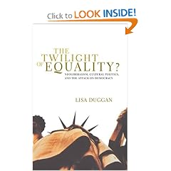
As I stand on the deadline of the deliverables, I realize one major thing: I made a large mistake. I should not have regarded the text I'm going to use for this project as the first thing I need to do. Largely this is due to the fact that measuring the amount of text is impossible. The various techniques and shading areas will not give me an accurate prediction. I would also like to thank my incompetency in ordering from amazon.com. I managed to try to order the book THE TWILIGHT OF EQUALITY from amazon.com. I managed ship the book to my permanent home address: In Cecil County.
The text that I have selected as of now is:
Chinese Exclusion Act May 6,1882 http://www.ourdocuments.gov/doc.php?doc=47&page=transcript
The Declaration of Independence July 4, 1776 http://www.ourdocuments.gov/doc.php?doc=2&page=transcript
Transcript of Constitution of the United States 1787 http://www.ourdocuments.gov/doc.php?doc=9&page=transcript
Secure Fence Act of 2006, Pub.L. 109-367, 120 Stat. 2638 October 26, 2006
Executive Order 9066: Resulting in the Relocation of Japanese (1942) http://www.ourdocuments.gov/doc.php?doc=74&page=transcript
Bill of Rights 1791 http://www.ourdocuments.gov/doc.php?doc=13&page=transcript
I'm also interested in including, the declaration of human rights. If a transcript is available, I will update this list shortly.
Possible Pictures.


For practice I'm going to use these pictures. I'm going to experiment with various techniques. I do think I'm going to still look for a human form that I can work on as well to get used to the human shape.

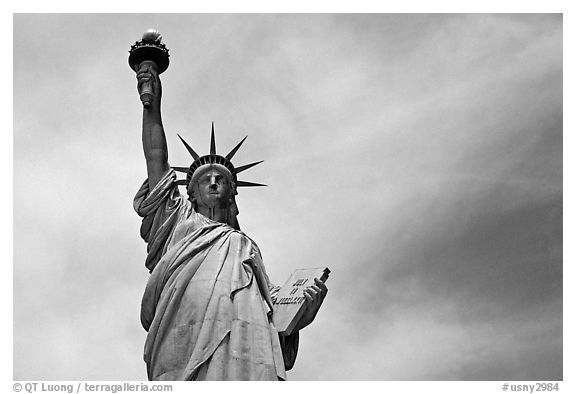
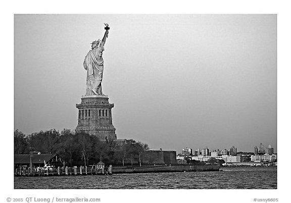
I've selected these images to choose from as my final project. I'm not ready to determine which one I will use.
Sunday, October 18, 2009
Standing Still

A museum is a great place to think. Thoughts and Ideas flow so readily in the beautiful environment. I love philanthropy. Unfortunately, the national portrait gallery did not have many black and white photos which really resonated with my artistic vision for the statue of liberty in the culmination of my work. The trip was not useless in that aspect as I did find some inspiration.
The trip to the museum led me to a couple of critical concepts as far as the artistic aspect:
--Use of vivid colors was more appealing; this means shading to cause gradients is important, and a picture that has more
--Focus on Clarity in the work. The focus has more clarity and the other parts are going to fade out into the distance.
--Make different ranges of clarity with different sizes of writing and different styles. I'm clearly going to need to try different styles and flip them around and play around with the styles.
The museum will definitely be frequented by me before semester end; I need to view a lot more of the artwork to figure out how I want to portray the statue of liberty.
Subscribe to:
Posts (Atom)